Case study on Santander cycles
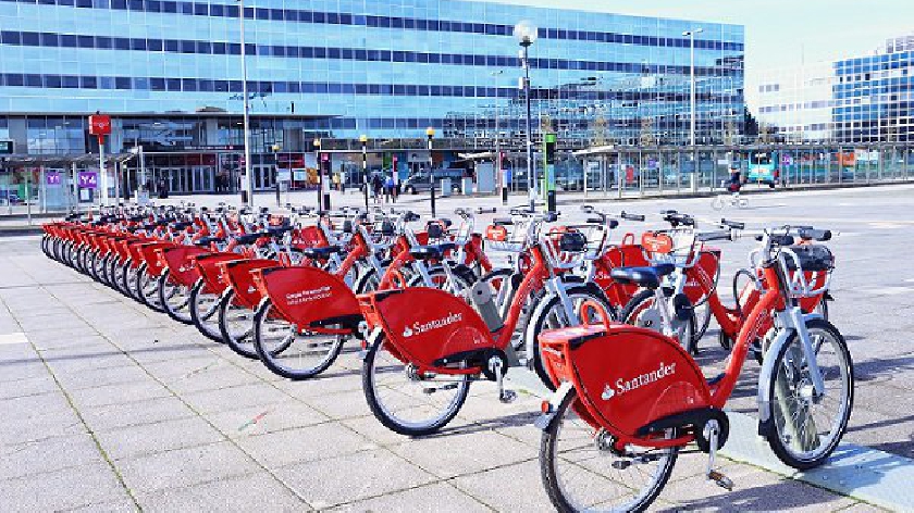
Santander Cycles (formerly Barclays Cycle Hire) is a public bicycle hire scheme in London in the United Kingdom. The scheme’s bicycles are popularly known as Boris Bikes, after Boris Johnson who was Mayor of London when the scheme began operating.
The operation of the scheme is contracted by Transport for London to Serco.Bikes and docking stations are provided by 8D Technologies. The scheme is sponsored, with Santander UK being the main sponsor from April 2015 (via wikipedia)
The TfL (Transport for London) provides readily available data on dayly hires of the Santander Cycles. We can get the latest data by running the following script.
# Saving URL
url <- "https://data.london.gov.uk/download/number-bicycle-hires/ac29363e-e0cb-47cc-a97a-e216d900a6b0/tfl-daily-cycle-hires.xlsx"

# Download TFL data to temporary file
httr::GET(url, write_disk(bike.temp <- tempfile(fileext = ".xlsx")))

# Use read_excel to read it as dataframe
bike0 <- read_excel(bike.temp,
                   sheet = "Data",
                   range = cell_cols("A:B"))

# change dates to get year, month, and week
bike <- bike0 %>%
  clean_names() %>%
  rename (bikes_hired = number_of_bicycle_hires) %>%
  mutate (year = year(day),
          month = lubridate::month(day, label = TRUE),
          week = isoweek(day))
Due to the COVID-19 pandemic, the British government has been forced to take measures to prevent and reduce the spread of the virus, such as lockdowns. It is then interesting to investigate whether these restrictions have had any effect on the usage of the Santander Cycles.
In order to answer our question, we need to plot the data and attempt to identify any pattern that might help us. The following code carefully explains how we can plot a graph which outputs the monthly average of Santander Cycles hired for the last 6 years, as well as the actual number of Santander Cycles hired per month each of these years.
# We create a new dataframe to compute the actual number of bikes hired the last 6 years
actual_bike <- bike %>%
               # filter for the past 6 years
               filter (year >= 2016) %>%
               # group by year and month
               group_by(year,month) %>%
               # calculate the daily mean of bikes hired per month, per year
               summarise(actual = mean(bikes_hired))

# The expected dataframe relates to the overall average of daily bikes per month, over the last 6 years
expected_bike <- actual_bike %>%
                 # in this case we only group by month, since we want to include all                     years
                 group_by(month) %>%
                 summarise(expected = mean(actual))


# We create a new dataframe to compare the expected daily number of bikes hired per month (mean of last 6 years), and the actual average daily bikes hired per month per year
comparison_bike <- left_join(actual_bike, expected_bike, by = "month")

# This shows the first 5 rows of the table
head(comparison_bike)
Now that we have the data cleaned and with all the relevant information we need, we can plot our grapth to study the effect of lockdowns on bike rentals.
comparison_bike %>%
  # We select the month as the independent variable
  ggplot(aes(x = month, group = 1)) +

  # We create a black line plot with the actual average number of bikes hired
  geom_line(aes(x = month, y = actual), color = "black", size = 0.1) +

  # We create a blue line plot with the total average number of bikes hired
  geom_line(aes(x = month, y = expected), color = "blue", size = 0.8) +

  # We fill the gap between both lines

  # If the black (actual) line is below the blue (expected) line, it means that the number of bikes hired is below average. We fill this gap with red
  geom_ribbon(aes(ymin = expected, ymax = pmin(expected, actual)),fill = "red", alpha=0.2)  +

  # If the black (actual) line is above the blue (expected) line, it means that the number of bikes hired is above average. We fill this gap with green
  geom_ribbon(aes(ymin = actual, ymax = pmin(expected, actual)),fill = "green", alpha=0.2)+

  # We create a different plot for each year
  facet_wrap(~ year) +

  # We select a black and white background
  theme_bw()+

  # We adjust the labels
  labs(
    title= "Montly changes in Tfl bikes rentals",
    y="bike rentals",
    x="Months"
  )
Is there then any effect caused by the lockdowns?
It becomes clear that the effect of national restrictive measures such as lockdowns have greatly influenced the bikes rent. This helps us explain the difference between the average number of rented bikes in May and June 2020 with previous years.
It is interesting then to understand what the percentage deviation from the expected number of bike rentals is, as it will help us better appreciate the effect of the measures. The following code explains how to plot this deviation, this time focusing on weekly averages.
# Same as before, we select a new dataframe to calculate the average daily bikes for each week of each year. The process is the same as before, switching 'month' by 'week'
actual_bike_w <- bike %>%
               filter (year >= 2016) %>%
               group_by(year, week) %>%
               summarise(actual = mean(bikes_hired))

# Same process as before to calculate the total weekly average over the years. Swith 'moth' with 'week' from the code of the previous exercise.
expected_bike_w <- actual_bike_w %>%
                 group_by(week) %>%
                 summarise(expected = mean(actual))

# We join both tables to have all the relevant information in one dataframe
comparison_bike_w <- left_join(actual_bike_w, expected_bike_w, by = "week") %>%
                     group_by(week) %>%

                     # In addition, we create a new dchanges colum, which calculates                         the percentage deviation from the expected mean
                     mutate(dchanges = (actual - expected) / expected )

# After examining the dataframe, we realize there is a datapoint that is wrong. We received data from week 53 of 2021, which is in the future. We remove this datapoint.
comparison_bike_w = comparison_bike_w %>%
  filter(!(year ==2021 & week ==53))
With our clean and organized dataframe, we can plot the graph using the code explained below.
comparison_bike_w %>%

  # We select weeks as our independent variable
  ggplot(aes(x = week, group = 1)) +

  # We create a line plot with the percentage deviation. The baseline is y=0 is the       overall average, as it would signal a 0% deviation from the mean.
  geom_line(aes(x = week, y = dchanges, fill = "black")) +

  # We fill the gap between the baseline and the plotted line

  # If the line is below the baseline, we fill it red as it signals lower bikes hired.
  geom_ribbon(aes(ymin = 0, ymax = pmin(0, dchanges)),fill = "red", alpha=0.2)  +

  # If the line is above baseline, we fill it green as it signals higher bikes hired.
  geom_ribbon(aes(ymin = dchanges, ymax = pmin(0, dchanges)),fill = "green", alpha=0.2)+

  # We create different plots for each year
  facet_wrap(~ year) +

  # We select a black and white background
  theme_bw()+

  # We adjust the labels
  labs(
    title= "Weekly changes in Tfl bikes rentals",
    y= "Bikes rentals",
    x="Weeks"
  )
Does this further support the hypothesis of lockdown effect?
We can clearly observe the largest percentage drops happening during the weeks when the national lockdown took place. Thus, this graph further supports our reasoning.
Finally, a question that you might be asking is why did we use mean bikes hired instead of median?
In order to calculate the expected rentals we used the mean of rented bikes/montly since we thought this was a better measurement. Since the monthly data of the actual rented bikes does not seem to be heavily right/left skewed, the mean is a good tool to calcukate the expected rentals. If the data were heavily skewed, we would have changed to the median.